Tyson 2022 Report.
This report uses a restrained industrial-modern layout with dominant brand colours, tight modular grids, sans-serif typography and full-bleed agricultural photography to project scale, transparency and environmental responsibility.

/
Challenge
(01)
Handling 50+ pages of dense ESG metrics, GRI/SASB indexes, third-party assurances and supply-chain detail while keeping the document visually calm, scannable and interesting.
All whilst staying visually consistent with Tyson’s corporate identity and avoiding fatigue from dense tables and long text blocks.


/
Solution
(02)
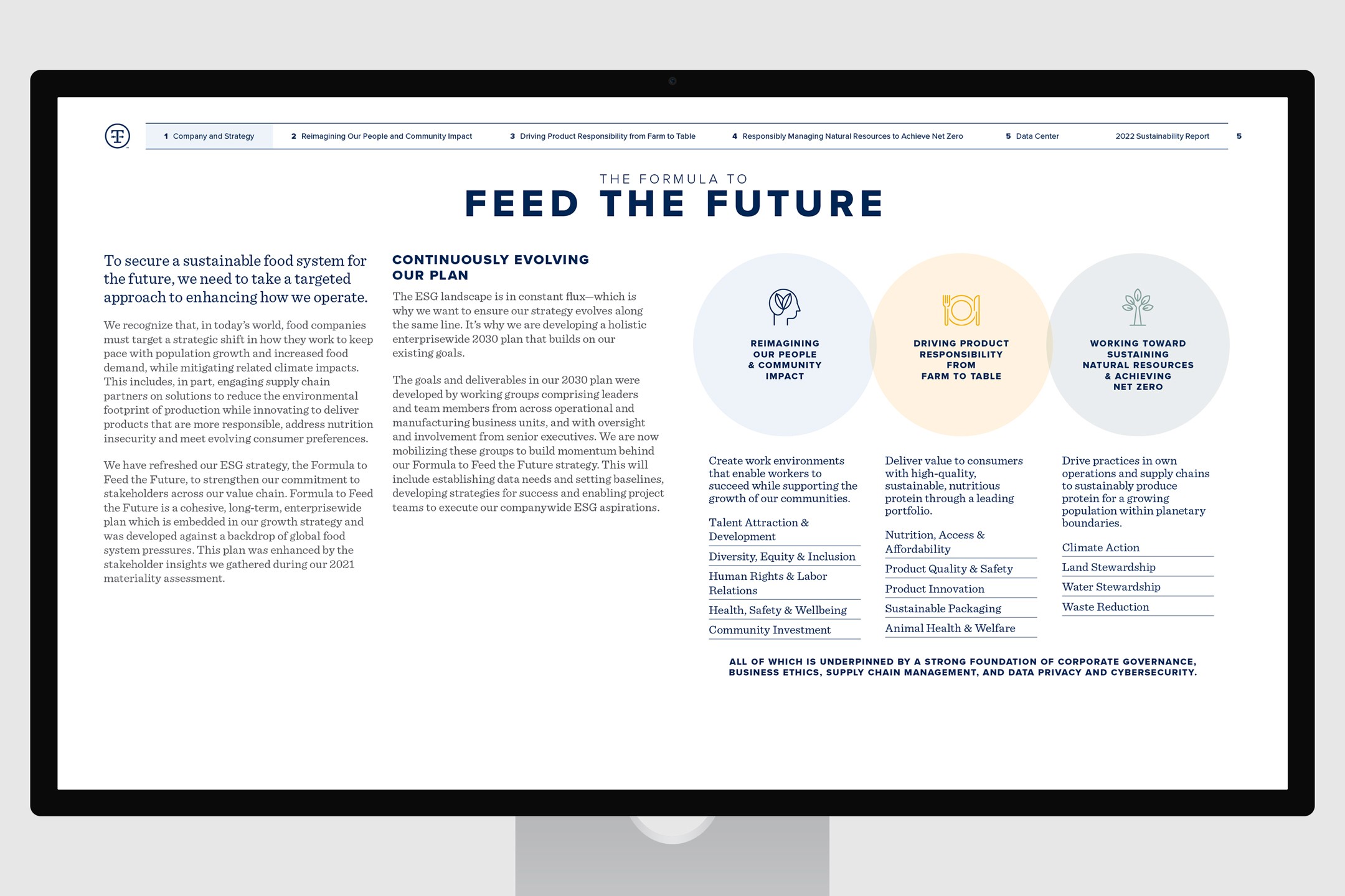
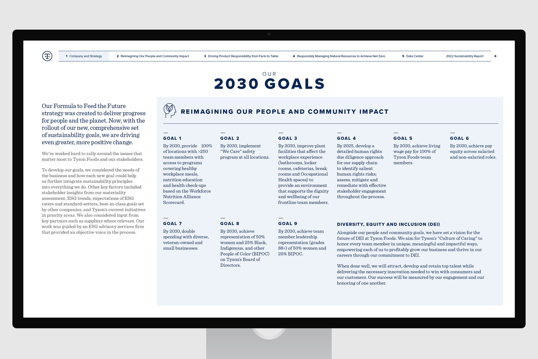
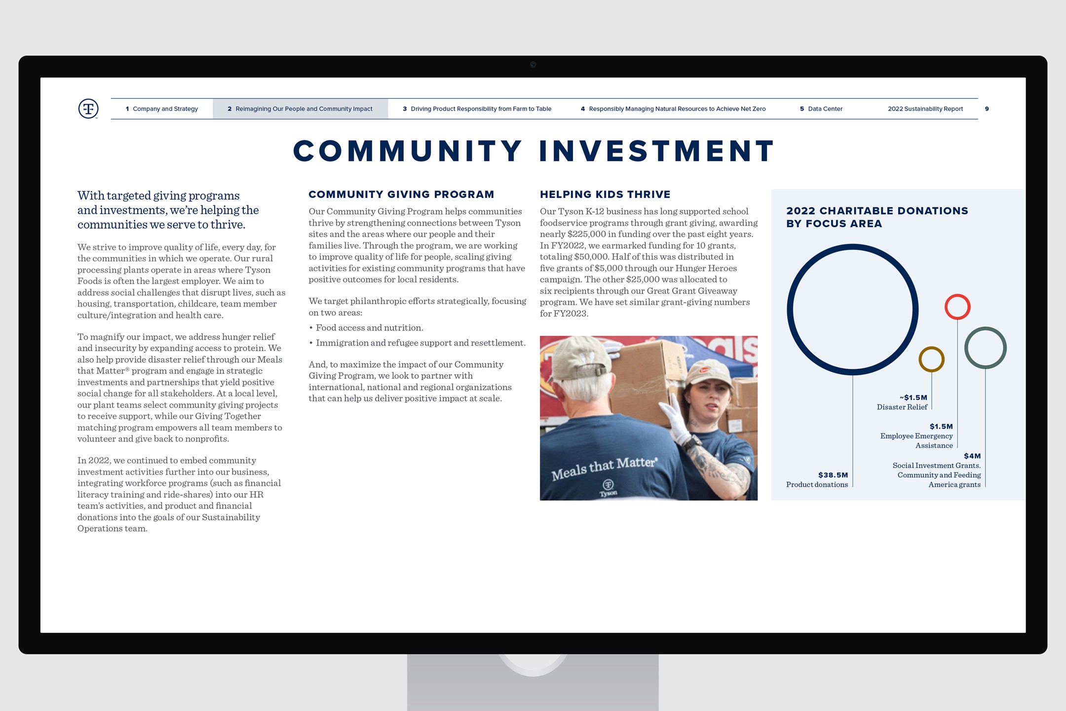
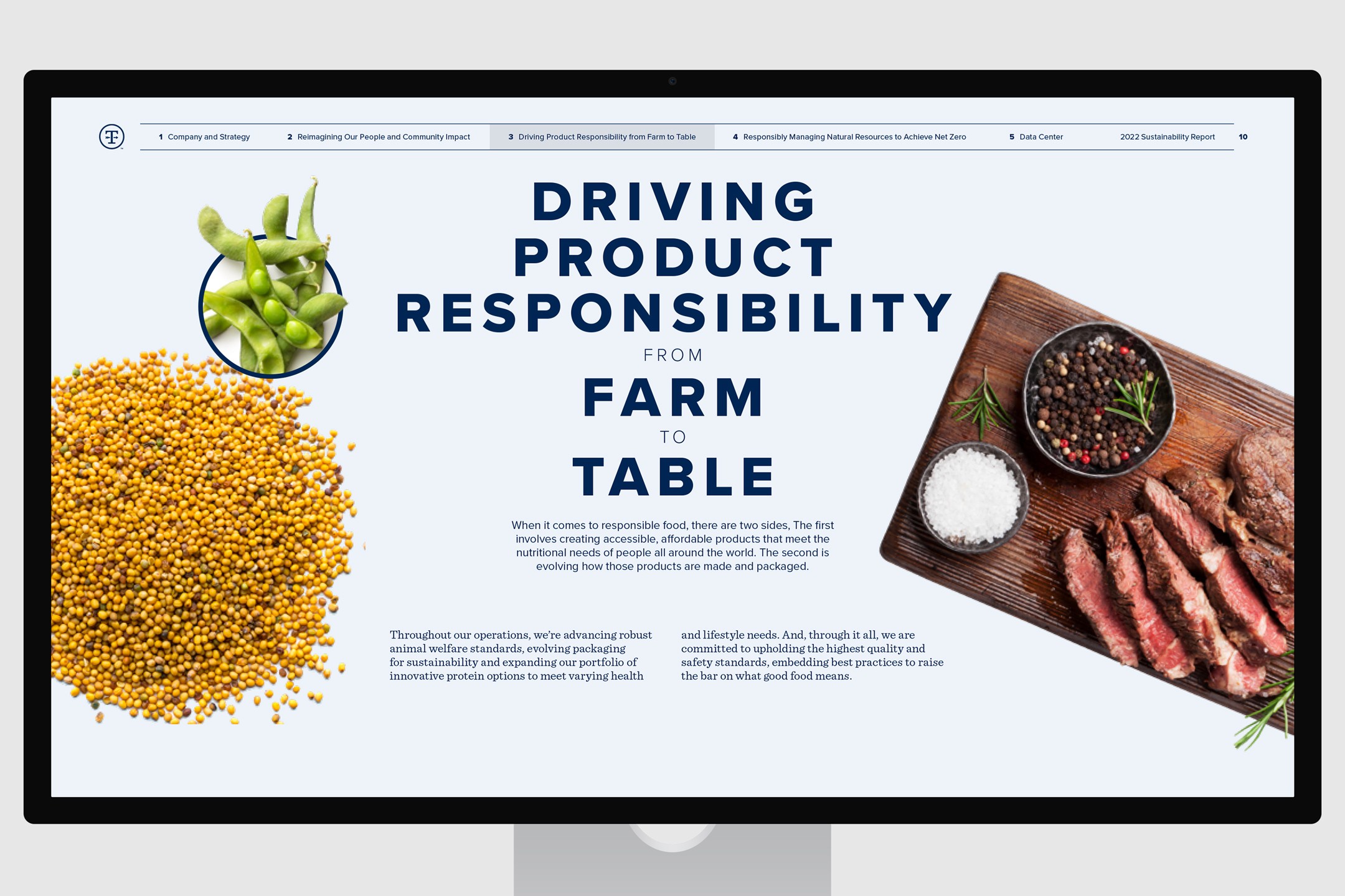
A strict grid anchors every spread. Bold navy headlines, light-grey 11 pt body text, alternating pale-green table rows and simple two-colour charts (navy lines/dots on white).
Full-bleed chapter starters layer saturated farm and processing imagery under semi-transparent overlays. Small icons mark sections. The tone is factual and controlled. Using cut-out images that the content flows around really helps bring the story to life.


/
Conclusion
(03)
The design is deliberately understated and institutional. It looks like a serious company reporting serious numbers rather than trying to sell a feel-good story.
Its tight grid, limited palette, clear typographic hierarchy and restrained visual language deliver clarity and trust at a glance, making a potentially overwhelming report feel controlled and professional. That's what a large food producer needs when publishing sustainability performance to regulators, investors and NGOs. I was sub-contracted by flag.co.uk to help design this report. Although this specific version didn’t end up being the final published document, it helped shape the direction of the released report (still visible in the live version).
Latest Projects.
© Smoll Studio
A curated selection of projects that reflect our commitment to simplicity and purposeful design.