Turn Foundry Corporate Documents.
Full branding project and annual report for Turn Foundry. Creating a sleek corporate identity and a clean, modern report that captured the company's innovative blend of engineering, architecture, and low-carbon building design.
Scope
Client
Duration
Year
/
Challenge
(01)
Building a distinctive brand and annual report from scratch that felt sophisticated, technical, and forward-looking without falling into generic corporate tropes.
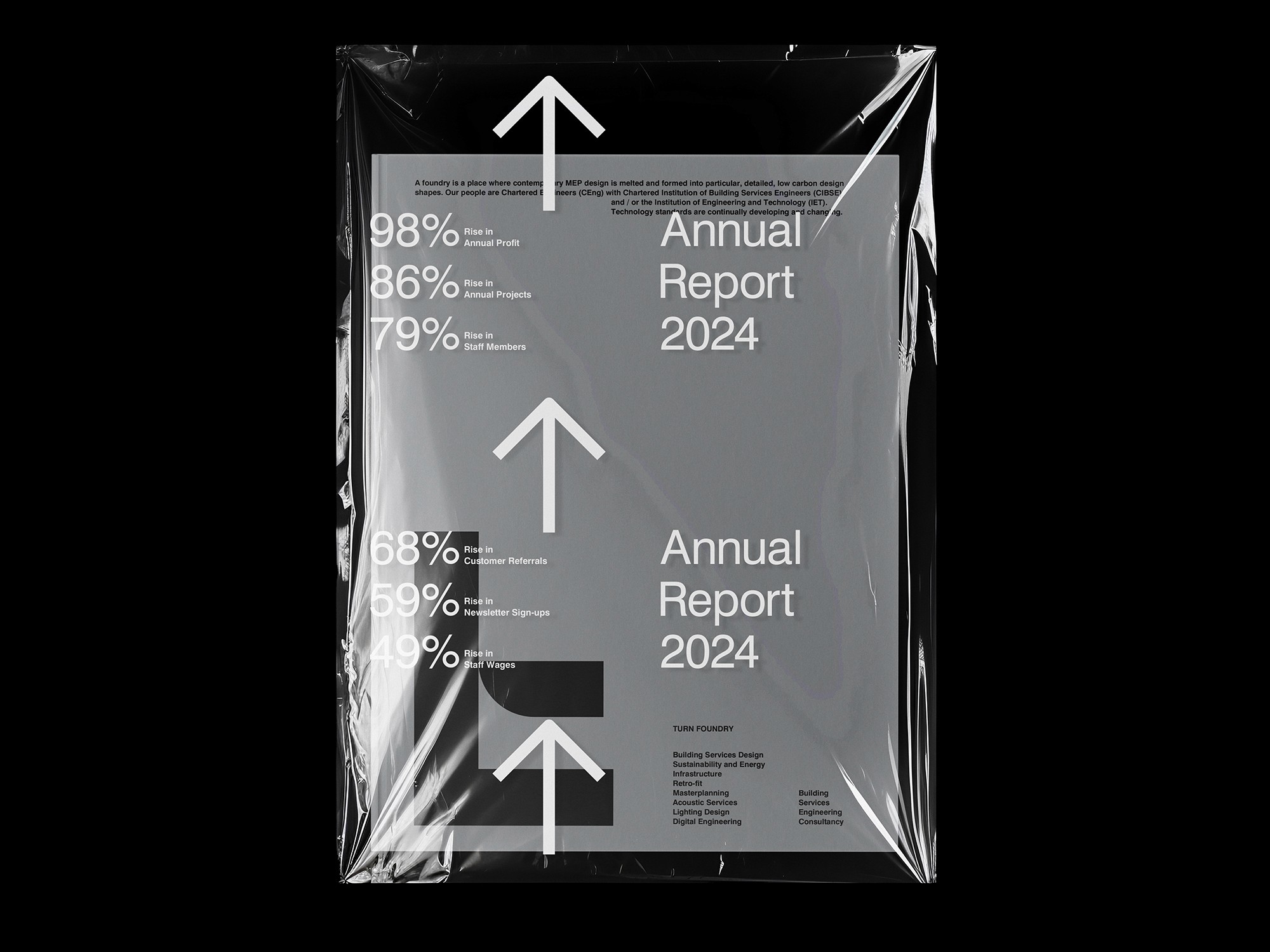
Turn Foundry brings together precise mechanical/electrical engineering, architectural creativity, and a strong focus on sustainable, low-carbon systems for buildings. The challenge was crafting an identity and report that genuinely reflected that unique "fusion" approach. It needed to look professional and credible to clients in construction and design. Also communicate their expertise and values clearly. Handle data and tell stories effectively. Plus stand out in a technical industry whilst remaining elegant, restrained, and memorable. No easy feat.


/
Solution
(02)
Creating a cohesive visual system and report layout that emphasised clarity, precision, and subtle innovation to mirror Turn Foundry's thoughtful process.
I developed the logo, colour palette, typography, and graphic language. Then applied it to the annual report with a clean grid, strong hierarchy, and purposeful visuals (diagrams, project imagery, data charts) that illustrated how their disciplines "melt" together into smarter, greener solutions. The design stayed minimal yet distinctive. Crisp typography for readability, restrained use of accent colours to highlight key achievements, and integrated elements that made technical content feel approachable and premium without unnecessary decoration.


/
Conclusion
(03)
Wrapping up with a brand and report that just feels like Turn Foundry – clean, clever, and quietly sure of itself.
In the end, the identity and the annual report landed exactly where I hoped they would. Sharp enough to hold their own in a room full of engineers and architects, but warm enough that you can sense the real thinking and care behind every line and diagram. There was this nice moment when everything clicked – the colours, the type, the way the pages flowed – and it suddenly looked like it had always belonged to them. It’s one of those projects that still makes me grin a bit when I think about it, because it didn’t just look good; it actually said something true about how they work and what they stand for. Client was very happy, I was very happy, and the whole thing feels like it’s doing its job out there in the world. That’s the good stuff.

Latest Projects.
© Smoll Studio
A curated selection of projects that reflect our commitment to simplicity and purposeful design.