HMIC Annual Review.
I helped design the State of Policing 2015 report for HMIC whilst working at Navig8. Contributing to a clean, authoritative layout that presented complex policing data and insights in a professional, readable format. With strong typography, clear data visualizations, and a serious yet accessible public-sector aesthetic.

/
Challenge
(01)
Creating a credible, high-stakes annual report on UK policing that balanced dense information, regulatory authority, and visual clarity for diverse stakeholders including government, police forces, and the public.
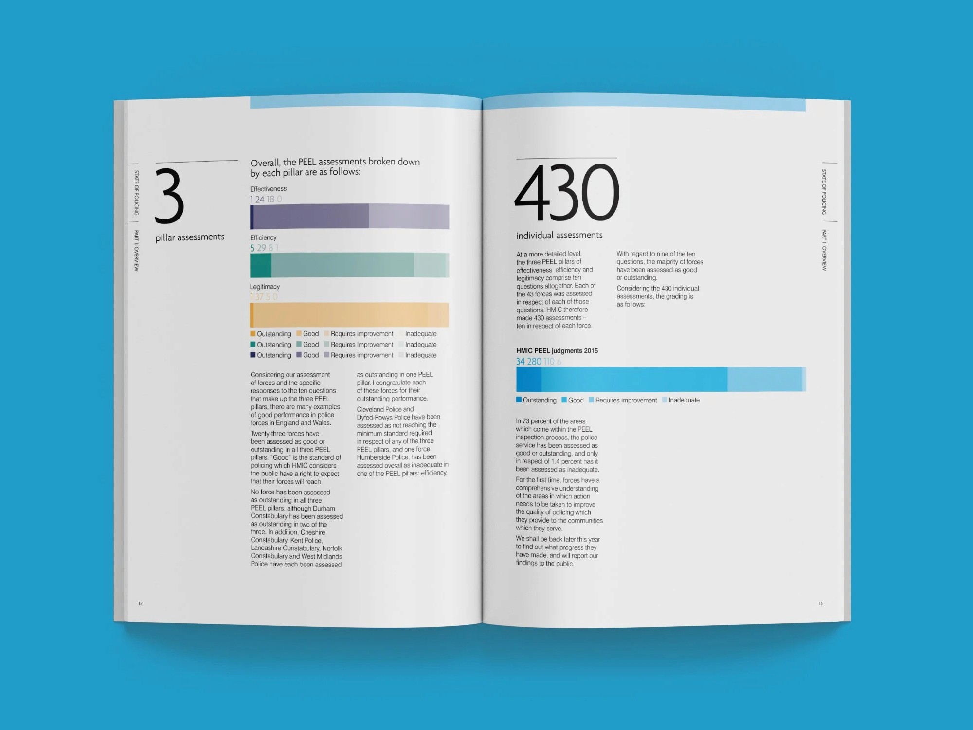
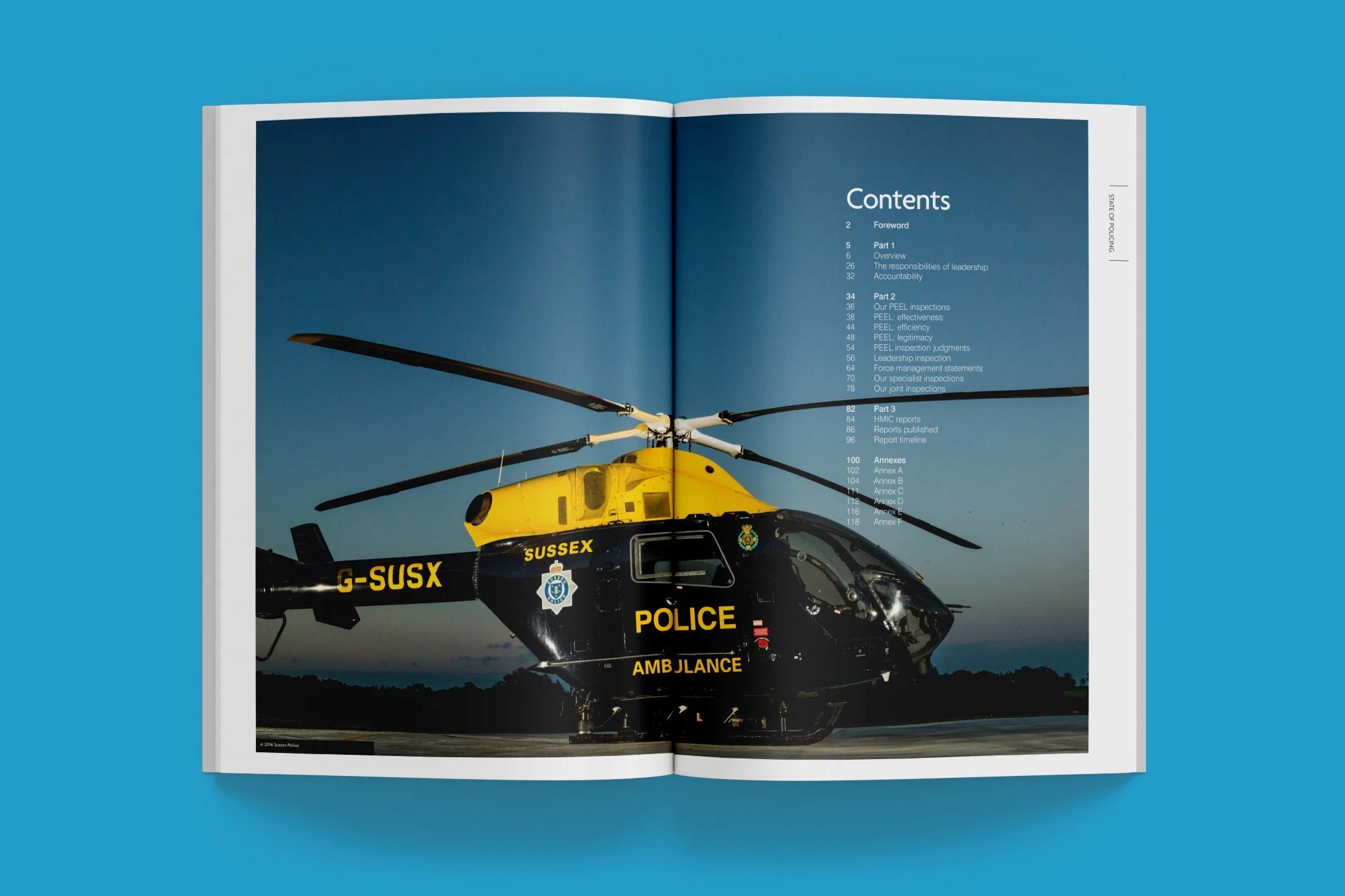
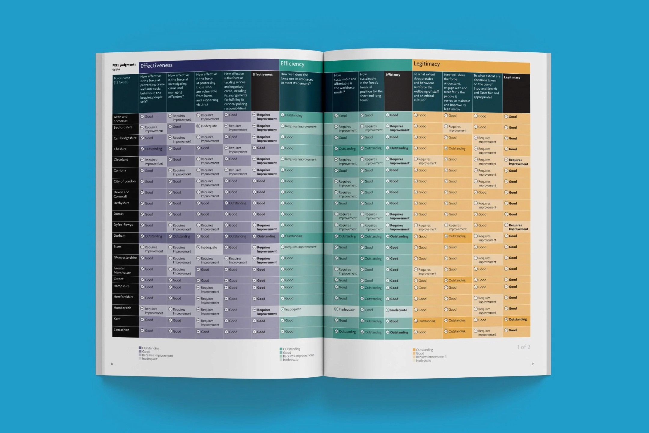
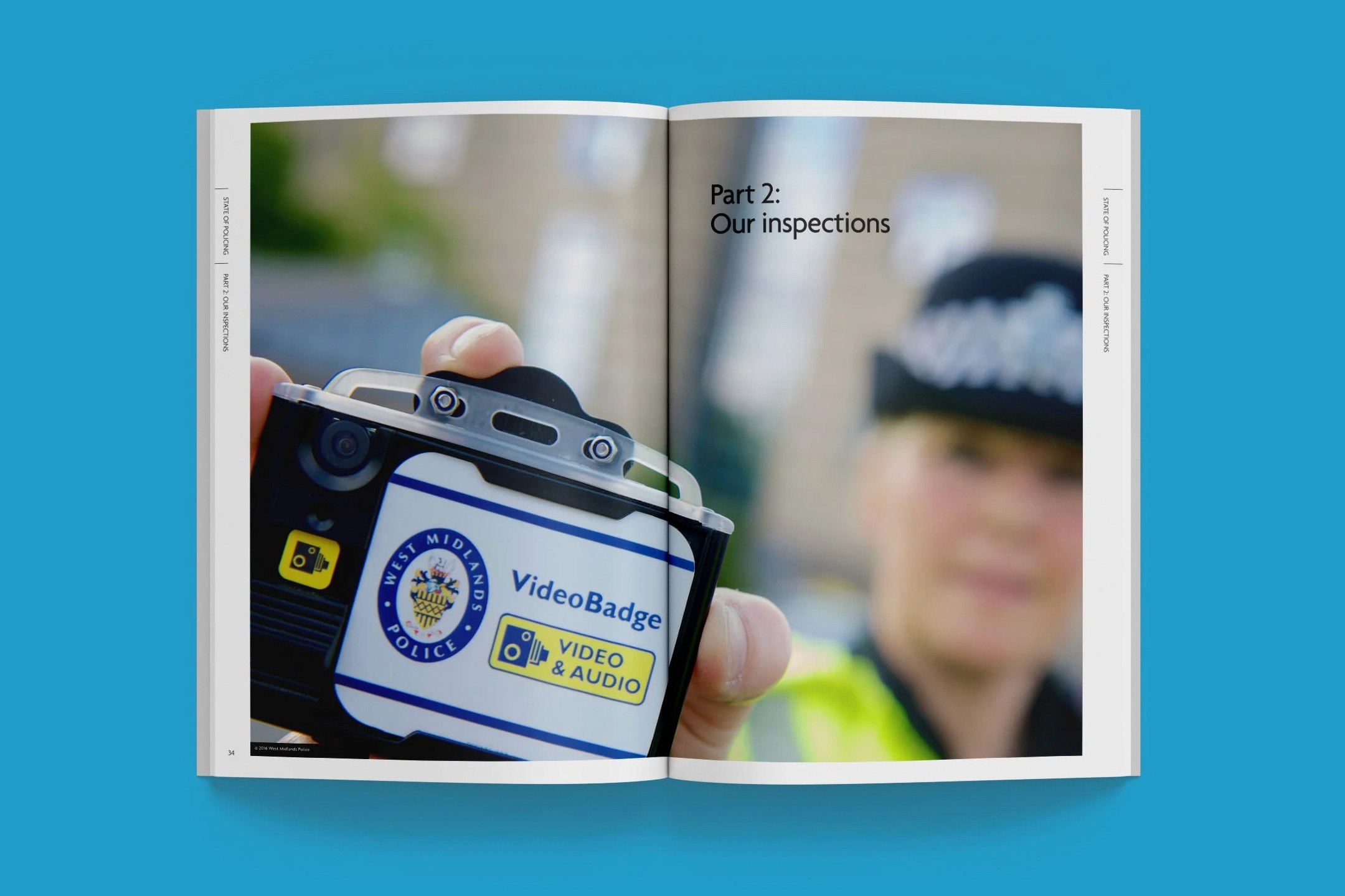
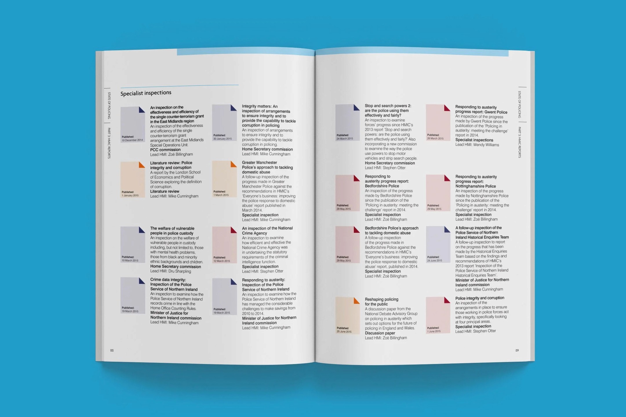
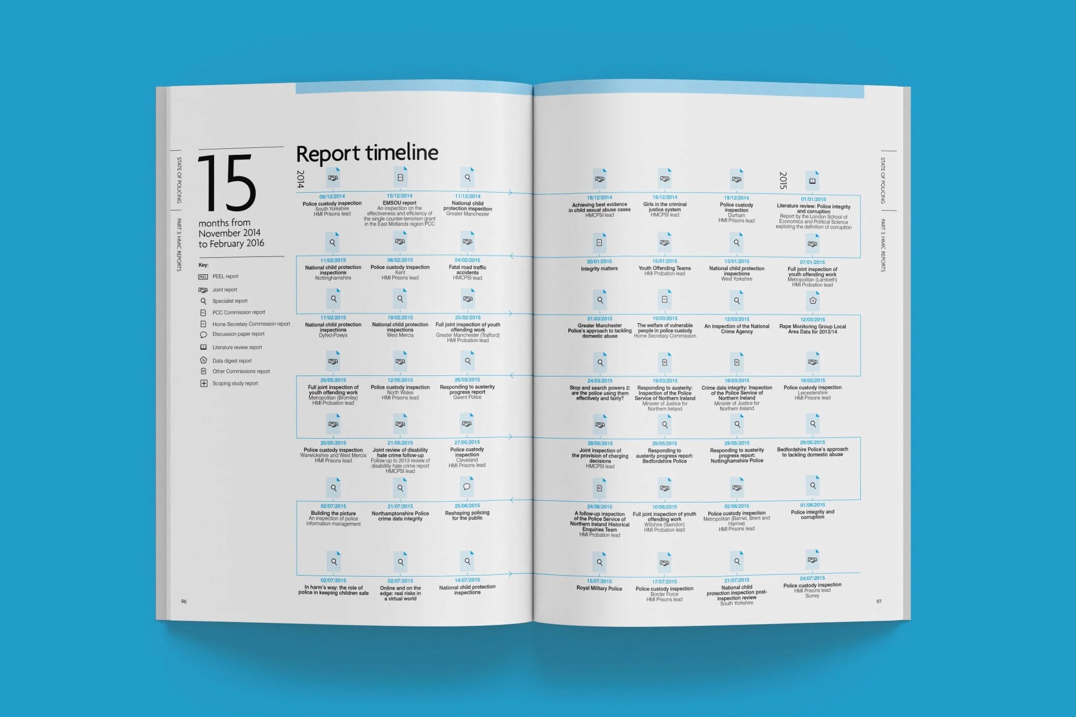
The State of Policing report is HMIC's flagship publication. It's a detailed assessment of forces' performance, risks, and progress. The challenge was to design a document that conveyed impartiality and gravitas while making complicated findings (statistics, inspections, thematic analysis) easy to navigate and understand. We needed to handle a substantial page count with multiple sections, charts, tables, and case studies without overwhelming the reader, all while adhering to strict public-sector standards for professionalism, accessibility, and print quality.

/
Solution
(02)
Deliver a structured, hierarchy-driven design with effective data presentation and restrained elegance that reinforced HMIC's authoritative voice.
Whilst at Navig8, I contributed to shaping the report's visual framework. With a clean grid system for consistent layout, strong typographic hierarchy for clear sectioning, purposeful use of colour to differentiate key elements (like findings, recommendations, and force-specific data), and well-integrated charts, infographics, and maps that turned raw policing metrics into digestible insights. The cover and interior pages maintained a serious, trustworthy tone with minimal but impactful imagery, ensuring the focus stayed on the content while making the 100+ page document feel organised, professional, and approachable for its audience.

/
Conclusion
(03)
Delivering a report that commanded respect and made important policing insights feel clear and compelling to everyone who needed to read it.
The finished report stood out as a solid piece of communication. Where the design quietly supported the weight of the words, letting the findings on performance, leadership, and public trust shine through. Working at Navig8, we helped turn a potentially dry regulatory document into something that felt authoritative yet human. It was easy to follow, visually calm, and genuinely useful for decision-makers and the public. It earned its place as a benchmark for how public-sector reporting can be both serious and effective, and it still feels good knowing the work helped get critical information out there clearly.

Latest Projects.
© Smoll Studio
A curated selection of projects that reflect our commitment to simplicity and purposeful design.